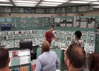
Modern user-centric design has its roots in the security space: The worst commercial nuclear power plant accident on U.S. soil was a direct consequence of a poor control panel design.
In 1979, reactor number 2 at Three Mile Island Nuclear Generating Station in Pennsylvania partially melted down. Don Norman, now generally accepted as the father of UX design, was one of the experts brought in to investigate the accident. He and his colleagues concluded that the catastrophe could be attributed to the confusing array of buttons, lights and switches on the control panel. When a pressure relief valve became stuck open, large amounts of nuclear reactor coolant escaped; power plant operators did not close the valve, however, because an indicator light (one of about 1,200 lights on the panel) misleadingly seemed to indicate that the valve was shut.
The initial finding attributed the accident to “human error,” but Norman showed that the system that made sense to the engineers who created it was alarmingly complex to the power plant operators who used it. It’s easy to blame the user for “doing it wrong,” but shouldn’t we design products and experiences for humans to use correctly?
READ FULL ARTICLE HERE


